Table Of Contents
A good layout is a prerequisite for a high-performing site. Your website should look clean and appealing—but more importantly, it should help users find what they’re looking for quickly and easily.
If the layout is confusing or all over the place, there’s a good chance users will leave before taking any action. To keep visitors from bouncing, we’ve put together a simple website design guide that walks you through creating a layout based on six core fundamentals.
What Is Website Layout Design
Website layout design refers to the arrangement of page elements that enhance the user experience on your site. A layout determines the order in which information and visual components appear—things your users pay the most attention to, like content, booking forms, checkout pages, and more.
Why Is Page Layout Design Important?
61% of users will leave a site if they can’t find what they’re looking for quickly. On top of that, easy navigation is considered the most important feature of a website by 94% of users. If your site doesn’t have a well-thought-out layout, visitors may bounce before they even get a chance to interact with your content.
Different Types of Website Layouts
One of the most practical ways to design a website layout is to look at existing layout ideas and draw inspiration from them. Exploring common layout formats can give you a solid starting point and help you decide how you want to structure your own web pages.
- Natural Eye Patterns: Eye patterns describe how humans typically scan information and navigate a website. Common patterns include the F-pattern, Z-pattern (also known as the zig-zag layout), and single-column layouts —most of which guide the user’s attention from the upper-left corner of the screen downward.
- Unique Approaches: For some designers, creativity takes precedence over traditional eye patterns. That’s where unique layouts come into play—like split screen designs and parallax layouts, which create an interactive sense of depth by scrolling different website layers at varying speeds.
- Common Designs: Some popular and easy-to-create layout designs include magazine layouts (great for blogs), card layouts (ideal for showcasing e-commerce products), and hero layouts (featuring large images and bold text—perfect for homepages or high-value landing pages).
The website layout you choose should align with what you’re offering your users. We recommend sitting down with a web design professional to ensure you’re taking the right approach. But if you’re going the DIY route, make sure to read the next section closely.
Build an Interactive Website by Focusing on 6 Key Aspects
Goals and Audience
First things first: What do you want to achieve with your website layout, and who’s using your site? An e-commerce layout will look very different from an online magazine, and a SaaS website might be the complete opposite of a travel agency site.
So, if you sell clothes, taking layout inspiration from automobile sites probably isn’t the best move.
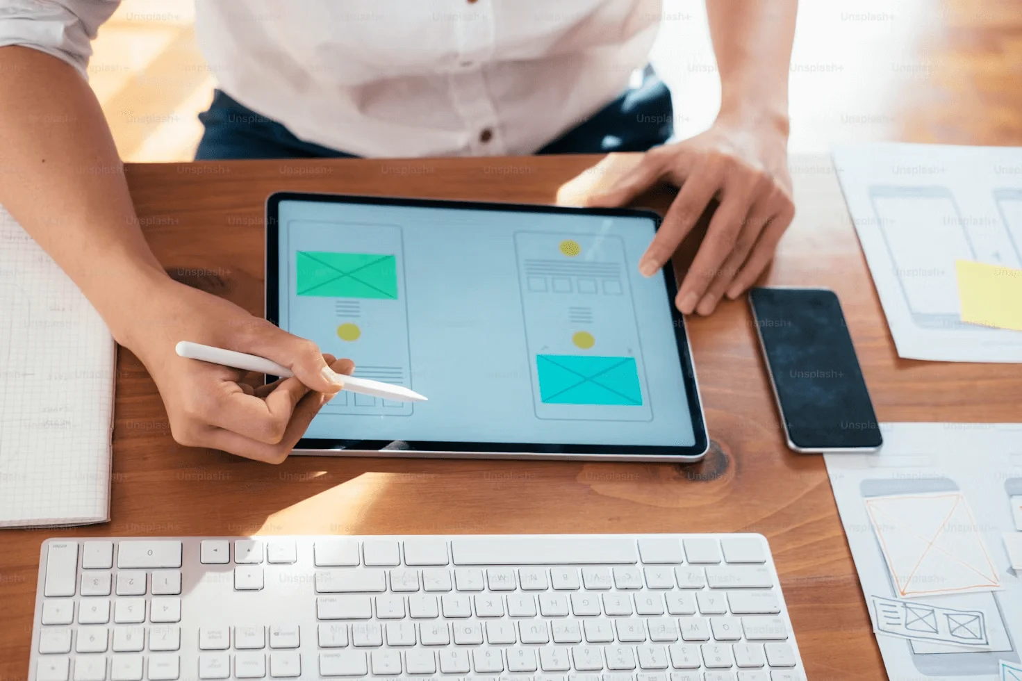
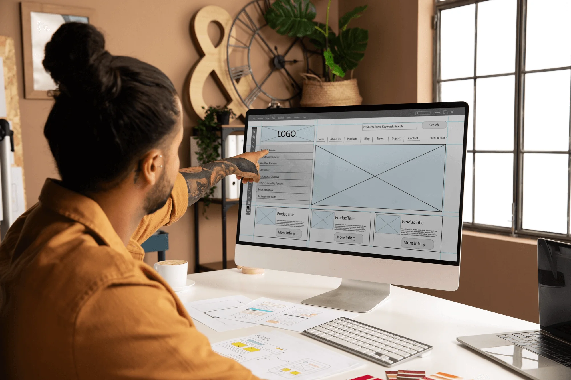
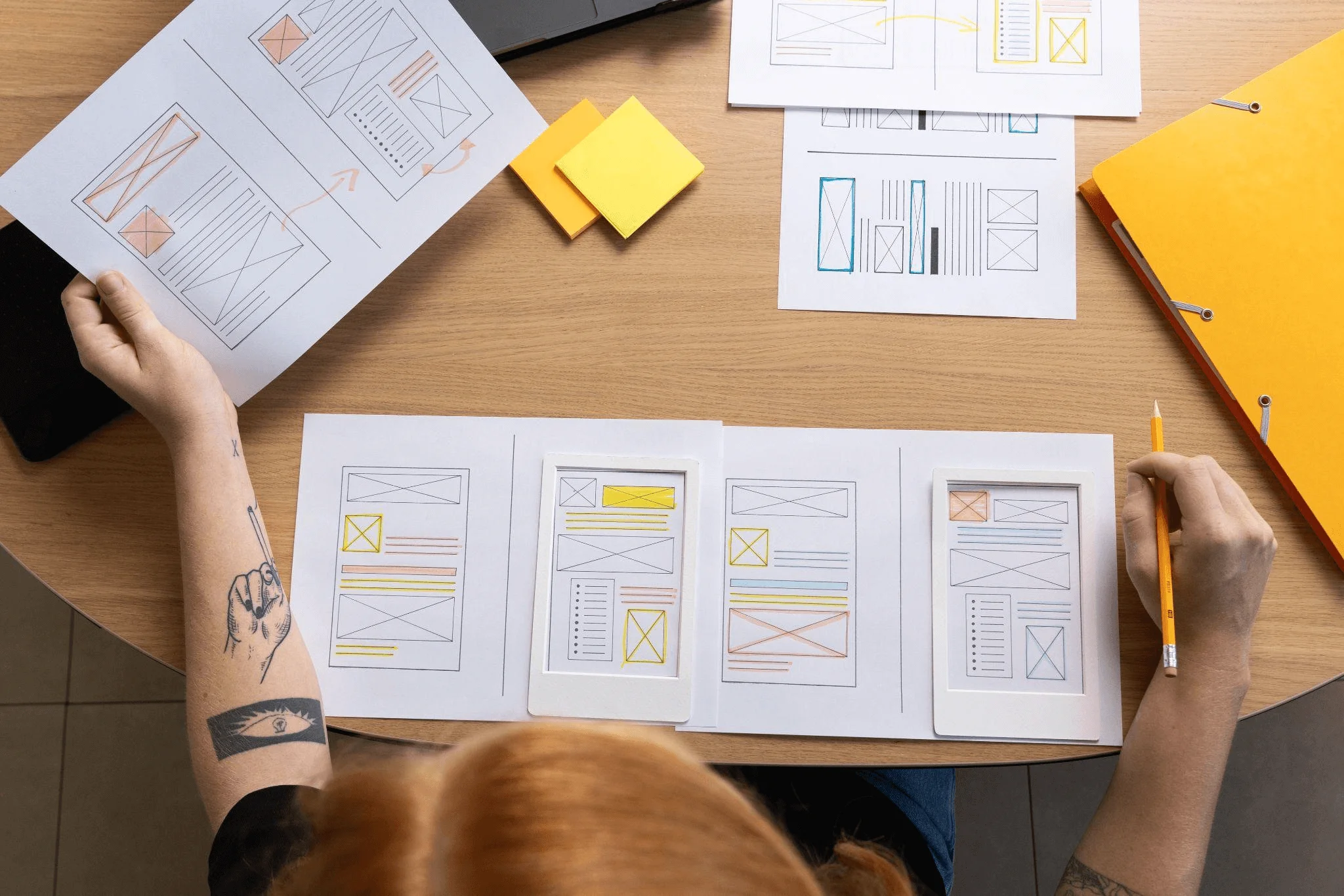
You should understand how your audience behaves online and design accordingly. We recommend creating a flowchart and wireframe to map out the steps you want users to take to reach their goals before you begin your web page construction—this will give you a clear picture of how to structure your layout.
Visual Hierarchy
Visual hierarchy refers to how you style six key design elements on your website to create contrast and guide attention. These elements are:
- Line
- Color
- Shape
- Framing
- Texture
- Typography
By focusing on your layout’s visual hierarchy, you can emphasize certain pieces of content over others—highlighting the parts of your site you want users to notice right away, like headlines and CTA buttons.
Content Planning
Content marketing and website design go hand in hand—and written content makes up 90% of the web. In fact, the whole purpose of layout design is to enhance how that content is presented—so content should be your first priority, not an afterthought.
You can have a flashy layout filled with appealing graphics—but it’s all wasted if your content doesn’t provide real value and relevance to your audience.
Start by writing your homepage, category pages, product or service pages, about and contact pages, plus a few blog posts. Once you have that foundation, you can move forward confidently with your layout design.
Reading Patterns
79% of people only ever skim a web page—that’s why it’s important to consider common reading patterns. These patterns describe how users typically scan pages and are often represented by directional shapes like the F-pattern or Z-pattern.
Incorporating reading patterns is a smart guideline, not a hard-and-fast rule. Some websites break away from these patterns yet still engage readers through stunning visuals and compelling content. Ultimately, it comes down to the resources and goals you have.
The Fold
“The fold” is the line where a web page gets cut off due to screen size limitations. Content that’s immediately visible when the page loads is considered “above the fold,” while everything you see after scrolling is “below the fold.”
Designers and developers use the fold to encourage users to keep scrolling, boosting a page’s scroll depth. Always place something highly engaging—like a compelling visual or headline—right at the fold to entice users to scroll down and see the full picture. Just be sure it offers real value, not just clickbait.
Negative Spaces
A website is filled with content—text, images, buttons—but it also has empty areas without any content. These are called negative spaces, or “white space.” It can be tempting for beginners to fill every empty spot on a page, but negative spaces are a crucial part of good layouts, often featured in minimalist designs.
A simple web page with a bold tagline usually draws more attention than one crowded with a wall of text or a stream of images. Put simply, more white space makes a page feel less daunting to read.
Unlike print, there’s no limit to how long your web page can be, so don’t worry about running out of space. Use white space to make your content and design look clean, sophisticated, and easier on the eyes.
Ready to take your website to the next level?
The experts at Digital Footwork can help you create an engaging layout that enhances user experience, boosts conversions, and maximizes your ROI.
Get in touch with us today!